You’re spending a lot of time, energy, and money on different marketing campaigns, from social media to PPC ads, SEO, and more.
But how do you know if all your efforts paid off? There’s only one way, and it is to analyze and track your results with marketing reports.
With a clear understanding of your different strategies and campaign results, you’ll know where to concentrate your efforts and where to stop wasting money.
And to convince your boss that your marketing campaigns are working or to invest more into a particular strategy, you need an easy-to-understand report that shows how all your hard work paid off.
What types of metrics and KPIs should you be tracking
Before starting to create your reports, you need to choose the right KPIs to track.
When it comes to choosing the right KPIs, there is no magic recipe. It all depends on what your objectives are.
Get Your Free SEO eBook
The goal of this ebook is to help small business owners learn more about SEO and take advantage of Google to bring in more traffic.
Are you looking to increase your organic traffic, click-through rates, or social media reach?
Every campaign is different, so make sure you only track the KPIs relevant to your business objectives.
You can also add these general KPIs that most businesses track no matter what strategies are in place:
- Customer Lifetime Value (CLV)
- Customer Acquisition Cost
- Return on Investment (ROI)
- Conversion Rate
- Website Traffic
- Domain Authority
- Bounce rate
- Cost-per-Click (CPC)
- Click-Through Rate (CTR)
- Best performing Landing pages
Regardless of what KPIs you decide to track, the only standard criteria is that they need to be SMART: Specific, Measurable, Achievable, Relevant, Timely.
In other words, the KPIs you choose need to provide a specific result that you can measure, that can be identified when you achieve it, is relevant to your goals, and can have a deadline or timeframe applied to it.
I’m sure you’ve received questions like: “Why don’t we have more social media followers?” Even though your strategies are aimed at something completely different.
To avoid these situations, make sure you are not tracking vanity metrics, as these will only confuse your boss and distract from your primary focus.
What type of tool should you use for your reporting?
There are multiple tools you can use, such as Excel spreadsheets, PowerPoint presentations, BI (Business Intelligence) tools like Power BI, or an automated reporting tool.
With excel, in particular, you can do pretty much anything you want, from custom calculations to lists and charts.
Business Intelligence tools offer custom metrics and calculations.
You can also create your own system or use a free tool like Data Studio.
There’s no right or wrong answer. You could use any of these solutions depending on your particular needs.
Here are some pros and cons to take into consideration.
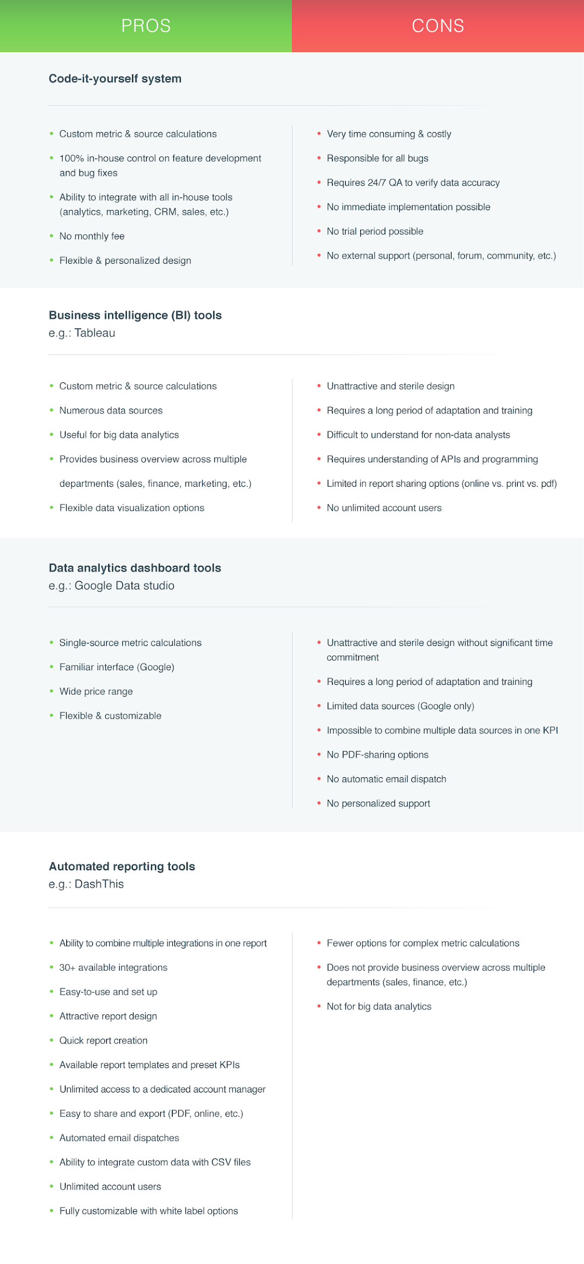
My preferred and recommended solution as a marketer is an automated reporting tool DashThis.
It’s not very expensive or complicated, and you can present all your data in one or multiple dashboards. The best part is that it’s all automated, so you never have to fetch your data from all your different marketing platforms. The report is automatically updated with new data every day.
To convince your boss that you’re doing a good job, your boss needs to have a clear, concise report. And that’s what automated reporting tools like DashThis do.
Here are some tools you can use to create your reports depending on your needs.
Google Analytics
Google Analytics is an essential tool. By looking at its different reports, you can analyze your website’s traffic and conversions and make sure your pages are optimized for each of your goals.
The only downside is that it doesn’t include all your marketing platform’s data, and the reports can be far from user-friendly.
Here’s an example of how Google Analytics can be helpful. The Audience Overview report shows you a ton of high-level data such as how many users came to your website, the average time they spent, and your bounce rate.
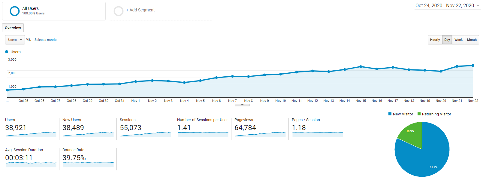
Bosses love to see these metrics, and it gives a good foundation of benchmark data you can use to gauge if your traffic is improving.
Google Sheets
Google Sheets is quite useful for gathering data from any platform, analyzing, comparing, and calculating it. You can use Google Sheets to make your reports, however, it might not create the best-looking presentation.
To make a better presentation, you can turn data from a Google Sheet into something more understandable at a glance.
Let say you’re exporting data from CallRail to a Google Sheet, and you want to see how long calls were.
By creating a chart, you can accomplish this! Without a need to go outside of Google Sheets, you’ve just made your data easier to understand, rather than looking at a ton of numbers within a spreadsheet.
Google Data Studio
Google Data Studio is the reporting tool provided by Google. It’s a neat tool to create reports, however, it comes with a lot of limitations. You can’t track platforms other than Google’s, like Facebook, Twitter, or Instagram. So you will most likely need to buy extra connectors.
As long as you’re reporting just on Google Ads, Google Analytics, and Google Search Console, this is a fantastic tool to use.
If you need to expand a little further because of your marketing scope, you’ll want to consider a higher tier option like Tableau or DashThis.
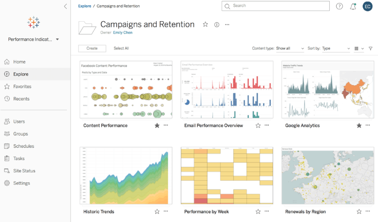
Tableau
Tableau is a visual analytics platform. It offers a lot of customization and powerful capabilities. However, it can be quite pricey, and the learning curve is relatively steeper than a lot of other reporting tools.
Hubspot
HubSpot is a complete tool. You can do almost anything with it, and it also offers a reporting add-on. You can create reports on HubSpot’s metrics or data from any integrated apps you may be using via the HubSpot App Marketplace.
You can create reports out of just about anything and then embed those into dashboards in HubSpot.
Here’s an example of the forms being submitted over a one month time period.
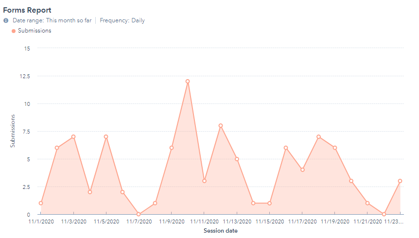
These dashboards give you a great view of the data that’s most important to you.
If your boss wants to see these reports at any time, you can set them up to be emailed daily, weekly, or whatever frequency you want.
DashThis
DashThis is a reporting tool made for marketers and agencies. It’s very easy-to-use and made to impress.
You can track any platform you use by choosing from over 34 native integrations (including Google Analytics, Facebook, Instagram, Google Ads, and way more), or add data from anywhere with Google Sheets or CSV files.
With DashThis reports, data is simple to understand. You can add notes and comments along with images of your ads and posts. On top of that, you get custom designed reports that can give that extra edge to your presentation.
How not to bore your boss with your report
If your reports are endless lists of numbers in a Sheet, your boss might not even look at them. But a marketing report doesn’t have to be boring!
Here are some tips to make sure your boss (or client) will not only read your reports but understand them!
1. Section your reports
To make your report as readable and understandable as possible, you need to section it.
You can section by marketing platform (Facebook, Twitter, GA) by marketing strategy (SEO, PPC, Web analytics, etc.) or by locations or regions, for example.
By doing so, your boss will easily be able to navigate through your report to find the information he’s looking for.
2. Add graphs and charts
It’s crucial to present your data in a visually appealing way.
To do so, graphs and charts are necessary.
It’s the best way to show your boss how your strategies are performing in the blink of an eye.
3. Add comments and notes
Your boss will see the report and understand which campaign performed well and which ones underperformed. But, they might not be able to pinpoint how or why.
That’s when comments and notes are necessary.
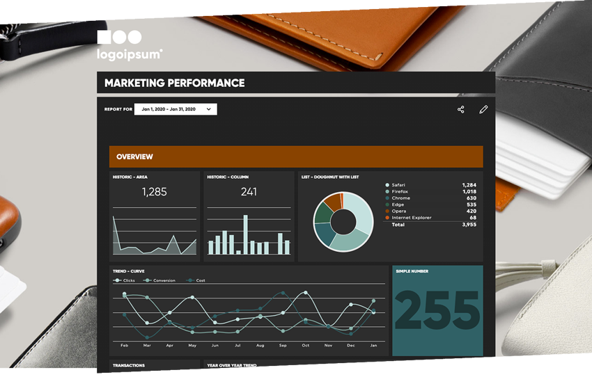
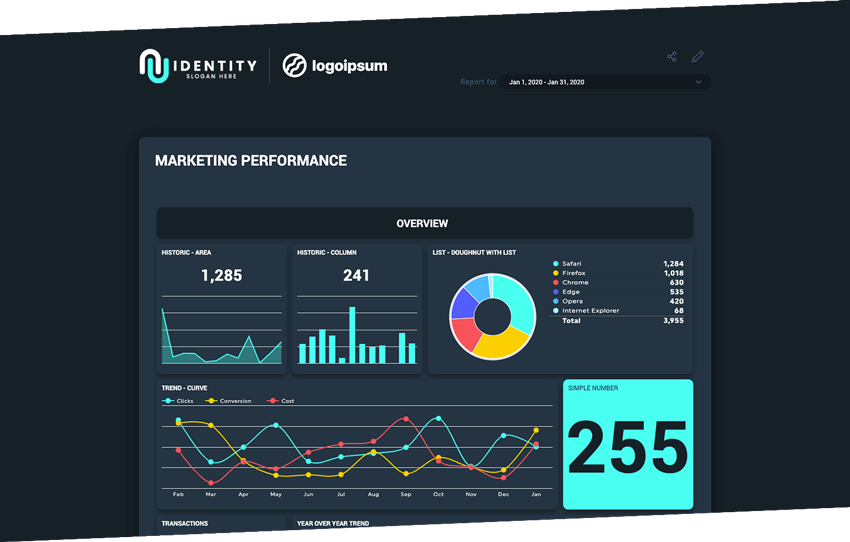
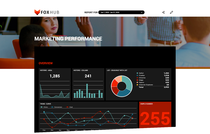
4. Get a white label design
To make sure your report impresses your boss, add an extra layer or “wow” effect with a custom design.
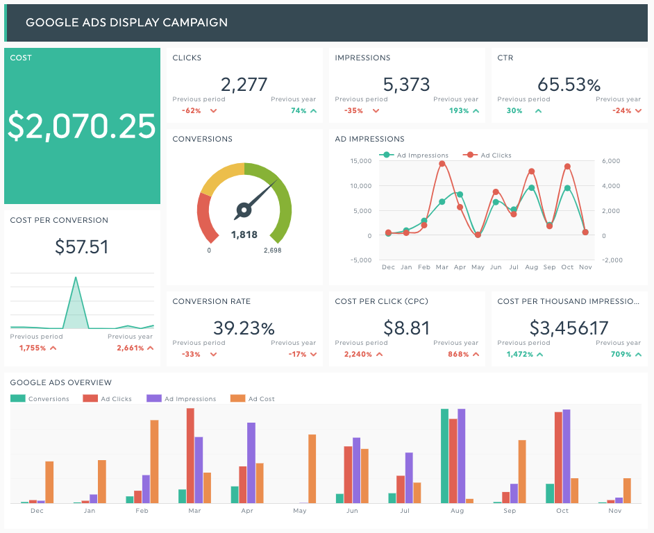
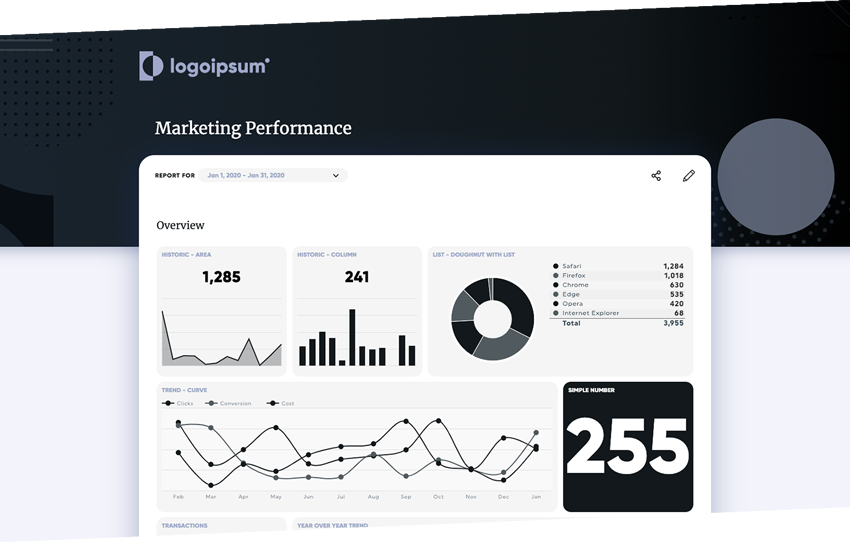
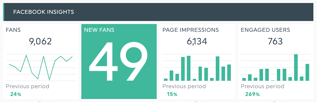
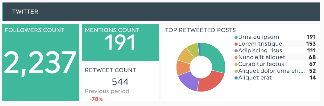
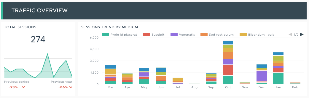
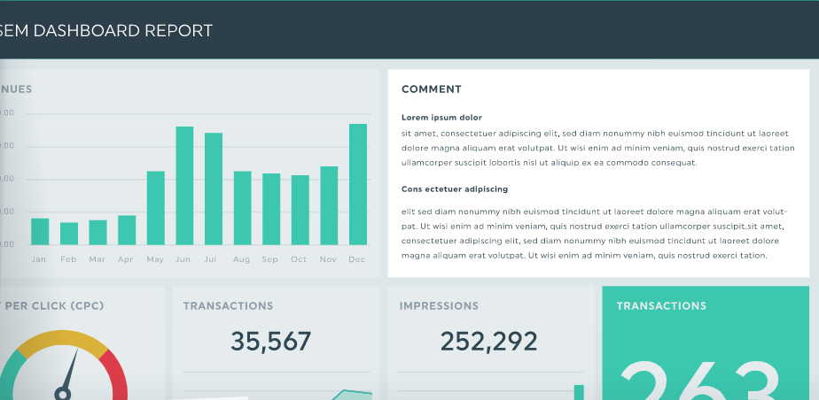
Here are some examples:
Time to Create your Reports
Now, you should be all set to create a report with all the information you need and impress your boss.
Let the data do all the hard work, and convince your boss with your beautiful all-in-one reports.