
Should big decisions be driven by data or your gut instincts?
With so much information available, it can be difficult to know.
Recently, Joe Girardi, the manager of the Philadelphia Phillies, was fired. The main reason? He was focusing too much on analytics.
Sometimes you have to use your gut and sometimes you have to use analytics. A great marketer knows that the best way to manage your business is to use a little bit of both.
In this article, I’m going to talk about how UI (User Interface) and UX (User Experience) should play into your marketing strategy – and how you can be sure that your decisions are driven by the right factors.
What is the difference between UI and UX?
You may have heard someone mention the phrase “but what about the UX/UI?”
They’re referring to two different things when they say this.
UI (User Interface) refers to the screens, buttons, toggles, icons, and other visual elements that you interact with. This can occur if you are navigating through a website, an app, or an electronic device such as an iPhone.
On the other hand, UX (User Experience) refers to the entire interaction you have with a product. This includes the overall feeling that you have with a brand or website as a user.
If you’ve ever been frustrated using a device, then you’ve suffered from a bad user experience (UX) because of a bad user interface (UI).
Not only does a bad user experience hurt your SEO rankings, but it may make your website not ADA compliant
What is an example of user experience?
One of the best examples of a great user experience is on the mobile app for Best Buy, an ecommerce website.
Based on my previous browsing history, the home page of the app shows products I’ve viewed recently or products I might enjoy
Not only do I usually browse video games, but I was recently looking at a TV (shown at the bottom). Best Buy is also suggesting a different TV if I scroll through the center products that are shown.
This makes my experience as a user better because I don’t have to spend time looking for things I want to see. The app shows me what I want and takes away my time spent searching through the app.
Having a great user experience means it’s easier for the user to find what they’re looking for.
How we use data at Miles to make improvements
Staying up to date with web trends is important. I wanted to share something cool we’ve been hard at work on lately and it involves improving the user’s experience (UX) on our website. (P.S. you can check out other cool website’s we’ve created here)
Here’s a glimpse of some of the subtle changes we made.
Notice how the old version of one of our industry pages below has our branding, but the text is laid out in a long line (this makes it less engaging to read).
There is also a navigation item on the right that drops users to specific areas of the page. We found that this aspect wasn’t getting clicked so we removed it.
The biggest item that was missing before was a call to action in the hero.
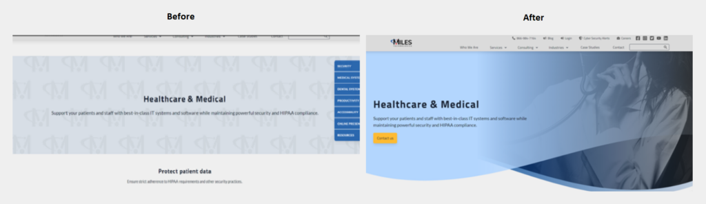
We implemented the above updates and you can see the latest version on the right.
So far we’ve seen a conversion rate of 3.45% compared to a conversion rate of 2.50% in the previous 18 day period.
It’s hard to pinpoint exactly what caused the user to convert at a higher rate if you make small changes. This is known as achieving statistical significance as it may just be luck of the draw if you achieved an increase in conversions.
When you make a large UI update like this, you can start to see bigger swings in conversion rates.
Data-driven vs intuition vs experience
It’s the data that really drives what we work on here at Miles.
In the past, we’ve made updates to our super creative website because we felt we needed to. There wasn’t any particular reason besides “we think this looks better.”
By utilizing reverse goal path reporting from Google Analytics, and setting up some fancy Supermetrics reports, we’re able to draw insight from our updates.
Even better, we’re able to understand what updates we should be making to our website based on metrics like this.
Focusing on Conversion Rate Optimization metrics
Our focus this year on conversion rate optimization (CRO) has seen a big increase in business.
CRO helps us spend the same amount of advertising dollars but get an increasingly higher return by way of more conversions.
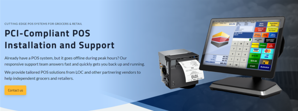
We took the same approach I outlined above for the service pages of our website. Since IT services are tough to visualize, we kept the background photo idea of someone working in place. POS was the exception as this visual is really attention-grabbing and Amanda did an awesome job mocking it up.
Our software and marketing service pages followed the lead of this POS page to show off our services with dashboards we’ve created, websites, and more.
We’ll continue analyzing the conversion rates of these pages and if we don’t see an increase in conversions, we’ll look at the data and try again.
A great marketer looks at the data and uses their gut together to make the best decisions.
If you’re trying out any other conversion rate optimization ideas to improve your UX/UI, I’d love to hear them!