
As a business owner or manager, you’re probably using Google Analytics in some way to monitor your website traffic.
Understanding your audience and analyzing your campaigns is key, and Analytics is super helpful for this. (If you’re not taking advantage of it yet, this is something our marketing team can help with).
Out of the box, Analytics comes with cool charts and lots of reports to look at. They make it easy to understand performance for initiatives like SEO
However, data is just data if you don’t know what to do with it. Visualizing this data so that it becomes meaningful is powerful and impactful for your bottom line.
Data visualization is the process of representing data in the form of charts, plots, and other graphics. It can help you better understand where you should be concentrating your efforts.
Using visualization techniques, complex data can be rearranged to tell a story that can easily be understood by your CEO or boss.
This article will help entrepreneurs leverage data visualization for their business to improve insights and drive better decision-making.
The Need for Data Visualization
As reported by the World Economic Forum, by the year 2025, a whopping 463 exabytes of data will be created each day globally. That’s a 1 followed by 18 zeros!
This will include an individual’s social media activities, Google searches, mobile application usage, other types of media shared across the web, data from wearable devices, and much more.
From the perspective of a business, the more data, the better. However, comprehending such a large amount of data is not easy for our human brains. It also becomes complicated if you try to analyze large amounts of data because this can lead to data overload.
By leveraging data visualization, this complex mess of data can be represented in a concise, creative manner, which can then be used to help you make informed business decisions.
With data visualization, the differences between seemingly identical datasets will become clear and provide greater transparency regarding your customers and business performance.
Data Leads to Better Marketing Campaigns
A deep understanding of your customers will result in well-designed campaigns that yield high returns.
People and businesses who have already paid you in some way are easier to convert than new users are.
If you know where your customers are hanging out on your website, in your app, or in your SaaS, you’ll be able to use that data to your advantage.
Think about how often you have logged onto Netflix and you see a show you really want to watch. It’s often the first thing you see.
You may also have said, “Wow, I was just thinking of this and here it is! So creepy!”
This isn’t a coincidence. This is data visualized and then interpreted to work towards that desired action.
Data Visualization Strategy
While data visualization provides greater clarity, it can be prone to human error. Here are a few important steps to follow to keep your representations accurate and relevant:
Define the Purpose
Before starting the visualization activity, hone in on the end goal.
Are you looking to find patterns in sales activities for the last 5 years?
Do you want to gain insights on customer buying trends for the last year?
Whatever question you’re trying to answer, be sure to actually start with this question.
Too often, CEOs will work towards collecting a lot of data for the sake of collecting data.
This data overload can lead to the constant need to acquire more data rather than the essential step of stopping to ask questions about the data.
Choose Your Data Sets
Data can take many forms. When it comes to Google Analytics, are you looking to measure users? Conversions? Pages they visit?
Understanding what you want to track is important because you need to make sure you have all of your tracking measurables in place.
Sometimes, customers ask us how often a particular PDF is being downloaded on a landing page on their subdomain.
While Google Analytics 4 and some custom event tracking can help interpret this out of the box, you would need to know ahead of time that you also want to track these types of events on landing pages that fall outside of the main domain.
It’s essential to start with the question and then create the means to collect the proper data sets that lend themselves to your goal.
Don’t Skew the Data
Visualizations you create will have a direct impact on important decisions made for your business.
While a visualization representing poor business performance may feel disappointing, its role is to help you gain clarity about the true state of the business and provide insights on how to improve.
Don’t try to always spin a positive light on results. Sometimes, recognizing poor performance can lead to the right decisions to right the ship.
Best Tools for Data Visualization
Data visualization takes many forms. Some are easier to start with and some are more complicated and require custom software development.
Here’s a list of the best visualization tools that can be used by your business, starting with the simplest and ending with the most complex.
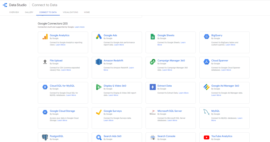
Google Data Studio
Google Data Studio is made for people who are just getting started with data visualization. You can download templates and then simply plug in your data sets to visualize the data.
Since it’s a Google product, you can only connect to Google-related products without a paid upgrade.
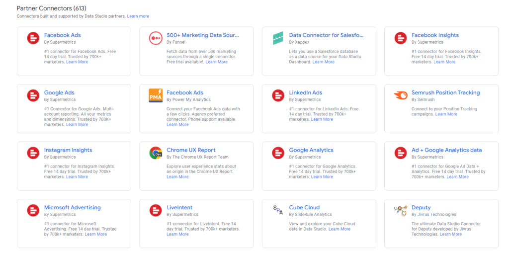
SuperMetrics is one of many great ways to connect other data sources like Facebook, LinkedIn, and Microsoft Advertising (formerly Bing). Other connection options include Funnel, Jivrus, and Foqal.
Luckily, Google owns products like BigQuery, which allow you to connect to large data sets. Unfortunately, this requires a custom developer to fully understand and set up.
While you most likely won’t use this out of the box, it’s great to know the option is there when your business expands.
What you most likely will be using at this stage to visualize data are Google Analytics, Google Ads, and Google Search Console.
If you want to go a step further than Google Data Studio, Google Sheets is an amazing option.
Google Sheets
Google Sheets seems like it might not be the best option for data visualization, but we’ve found that it does an incredible job if you know how to use it.
With a few fancy formulas and some color coding, you can make a report that highlights the important aspects of your data.
This is a small snapshot of one of our reports in Google Sheets that pulls data from the reverse goal path report in Google Analytics.
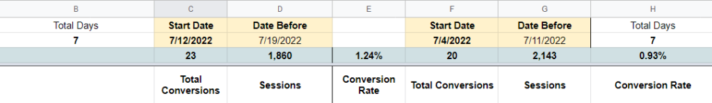
In general, this report may be difficult to understand right out of Google Analytics. Through Sheets (and a report in SuperMetrics that automatically pulls the data daily so it’s fresh), we can see the overall conversion rate for a specific set of pages compared to a previous time frame.
While it takes some knowledge of functions (particularly the Query function), it’s worth it to be able to simply open Google Sheets and see how well your pages are performing.
Tableau
As one of the prominent tools on the market, Tableau is used by companies worldwide. While the interface is simple to use, a bit of training is needed to get the most out of this tool.
Tableau is a great example of a business intelligence tool that takes a minute to learn, but a lifetime to master.
If you’re looking to use Tableau, you’ll most likely need a more advanced developer to help navigate the interface and pull in the right data.
Microsoft Power BI
Created by one of the leading tech companies in the world, you can expect this tool to have all the features you need to cover your data visualization requirement.
Being a Microsoft product, it has many pre-built dashboards and APIs that can connect your data from other data warehouses.
Now that you have a clearer understanding of data visualization and its importance, it’s time to start leveraging it. All it takes is a little research and dedication to begin exploring and learning different platforms. Before long, you can gain better insights, make informed business decisions, and more to set your business up for success.
Should you use Tableau of Power BI?
Since Miles IT has a ton of experts on this subject matter, we thought we’d catch up with Juan Diaz, a senior BI consultant, to see what he thought about the direction of use for these more complex data visualization platforms.
When I first began using data viz tools, I transitioned from Excel to Tableau, analyzing simple data and I was happy with the results because of Tableau’s pre-built visuals. At that time, Power BI seemed complicated, with many options, and a bit overwhelming. As the years passed, I attempted to answer more complex questions, used multiple/bigger data sets and more cleaning of the data was needed. I was exposed to Power BI more and I learned how I can actually leverage the many features to mold reports exactly how I need them. Power BI is now my go-to tool for data visualization.
Juan Diaz, Senior BI Consultant at Miles IT
Juan goes on to mention that when it comes to maintaining data at an enterprise level, he finds Power BI also helps with the data governance needs of larger organizations. This includes content ownership to enable non-technical users to create reports using approved data marts while maintaining a single source of the truth. As well as deployment pipelines for development and testing for those technical users who manage the maintenance of the data marts.
Each tool has its own unique strength. However, there are very rare instances where we would suggest someone to use Tableau over Power BI. For the mature data analyst, Power BI gives more power to the user.